 As everyone knows in the photography community Tuesday was the big release of Adobe® Photoshop® Lightroom® 2. I have spent the last few days poking, prodding and testing the new software. I still haven’t completed my under-the-hood check-out, but so far I like what I see.
 One of the things that stand out is the layout. In the develop module is where I have seen the biggest layout change. Most of the tools i.e. crop, red eye adjustments are now in the left menu bar. Before they were positioned under the image workspace.
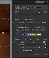
Also, a major new item is the ability to make adjustments to localized areas of a photograph vs. the entire photo. You can also burn a dodge your images. Previous this was not a feature of Lightroom® I, only in Adobe® Photoshop®.
Side Bar…
Tuesday, I spoke to Thomas Hawk (Flickr) of the infamous Thomas Hawk’s Digital Connection. We discussed the new Adobe® Photoshop® Lightroom® 2. Thomas has been a big user of Adobe® Bridge®. Over the year he has a developed a great workflow in Bridge® that has work very well for him. In a previous conversation month back, I asked if he was using Lightroom® I? He had said he tested the software, and that Bridge was a better fit for his workflow.
However, Tuesday produced a different response from Thomas Hawk. He said he really liked the new Lightroom® 2, and was going to start using this Photo management software, now instead of Adobe® Bridge®.
Thomas Hawk has put up his own review of the new software which you can read it here. Click… Here. I will check back with him at a later date to see how he still feels about Lightroom® 2 or find out if he has gone back to Adobe® Bridge®. “The Proof is in the Pudding”.
That’s it for me. Have a nice weekend. Keep you focus sharp and you lens clean.


No comments:
Post a Comment